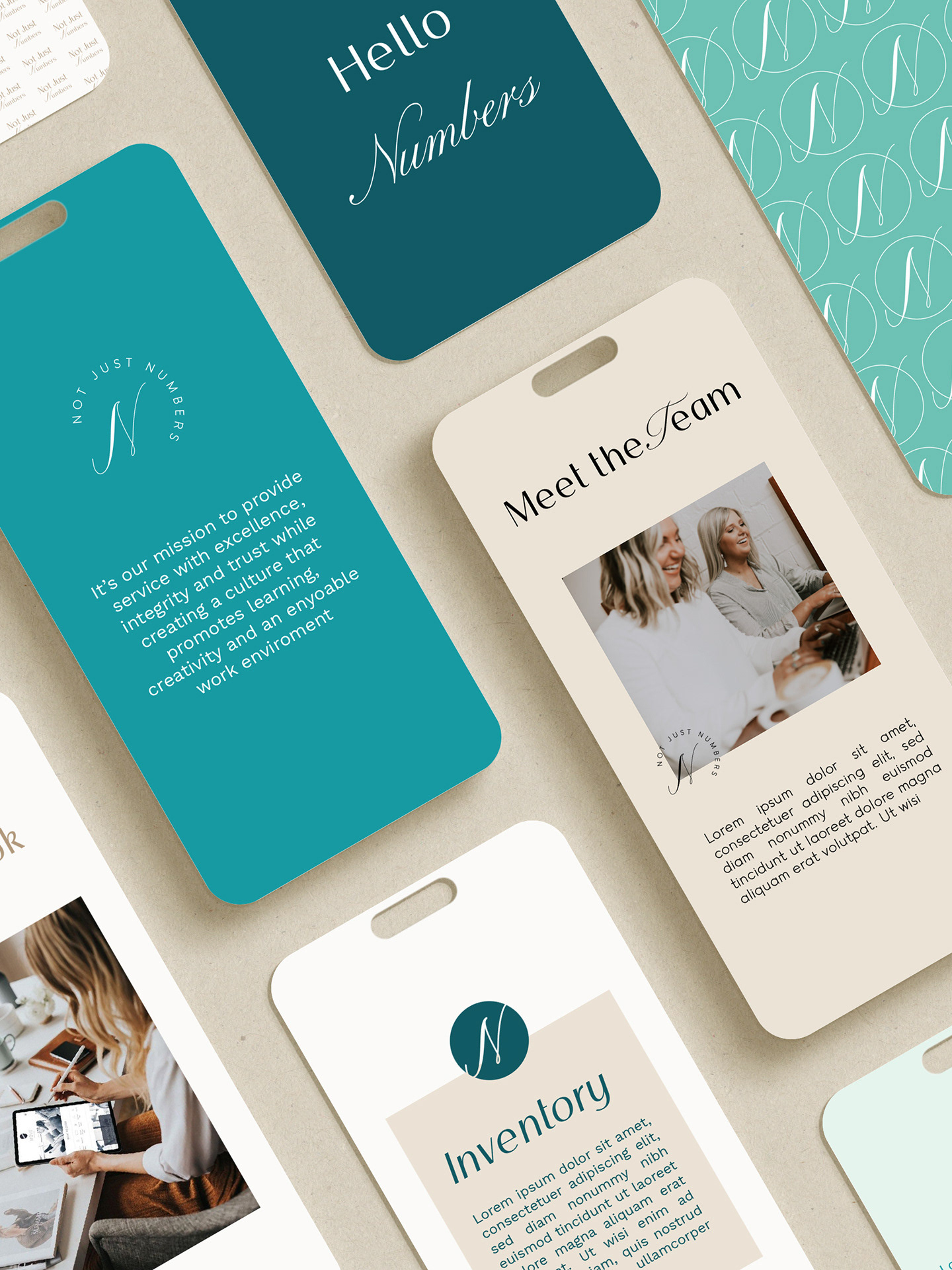
Carleen Candles represents more than just beautifully crafted products—it’s a mission to create toxin-free, pet-safe candles that bring comfort to every home. Emily, the founder, wanted her branding to reflect her personal journey toward health and well-being.
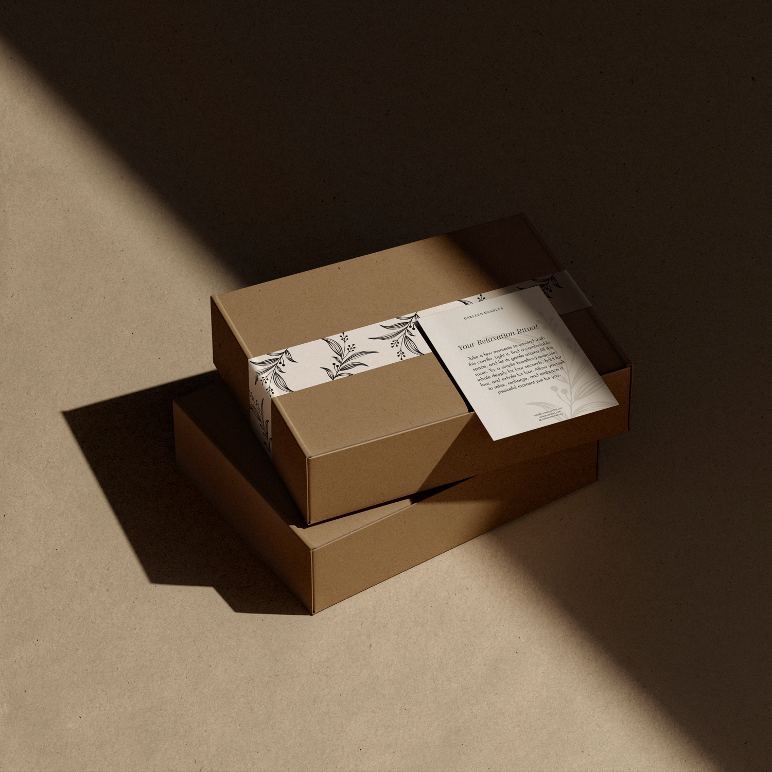
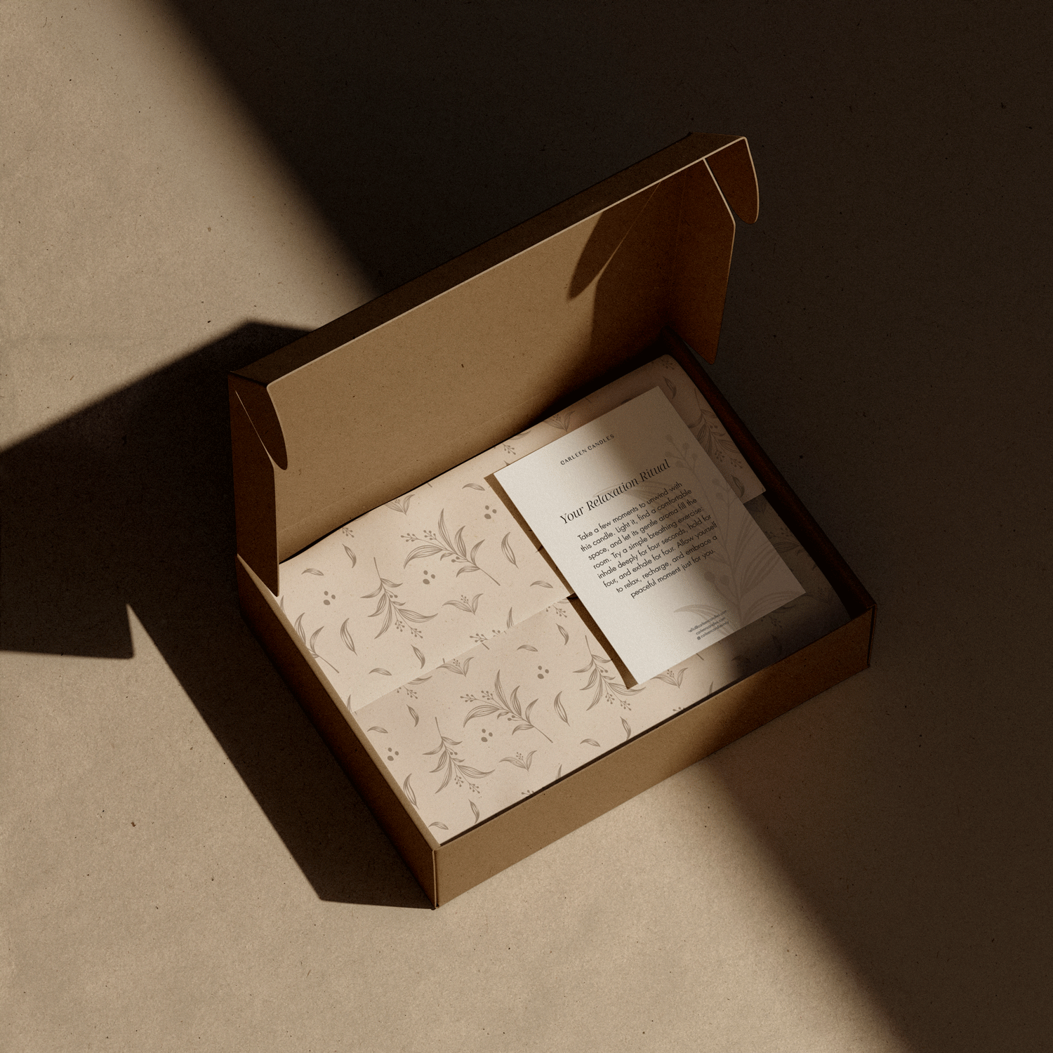
This project was a complete rebranding, transforming a brand that previously lacked a cohesive identity. The original branding used multiple fonts without a clear purpose, which made it feel inconsistent. I designed a clean, heartfelt brand identity that radiates warmth and simplicity. The calming color palette, paired with sustainable packaging materials, conveys safety and care, aligning perfectly with Carleen Candles’ mission.
This collaboration resulted in a brand that feels genuine and approachable, connecting deeply with customers who prioritize their well-being and their pets.
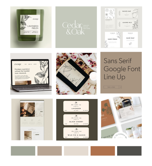
Moodboard & Creative Direction
Before designing the brand identity, I conducted an in-depth brand strategy session with my client to define the brand’s essence, values, and audience. Based on this foundation, I curated a moodboard that served as the creative starting point.
This moodboard brings together inspirations from packaging, logos, website design, typography, and color palettes, carefully selected after thorough research. The soft greens, warm beiges, and muted earth tones evoke a sense of nature, sustainability, and tranquility, aligning with the brand’s focus on non-toxic, eco-conscious products. Clean, modern typography enhances clarity and authenticity, while hand-drawn botanical illustrations add an artisanal touch, reinforcing the handcrafted nature of the brand.
By establishing this strong visual and conceptual foundation, I ensured that every design decision—from the logo to the packaging—stayed true to the brand’s identity and vision.
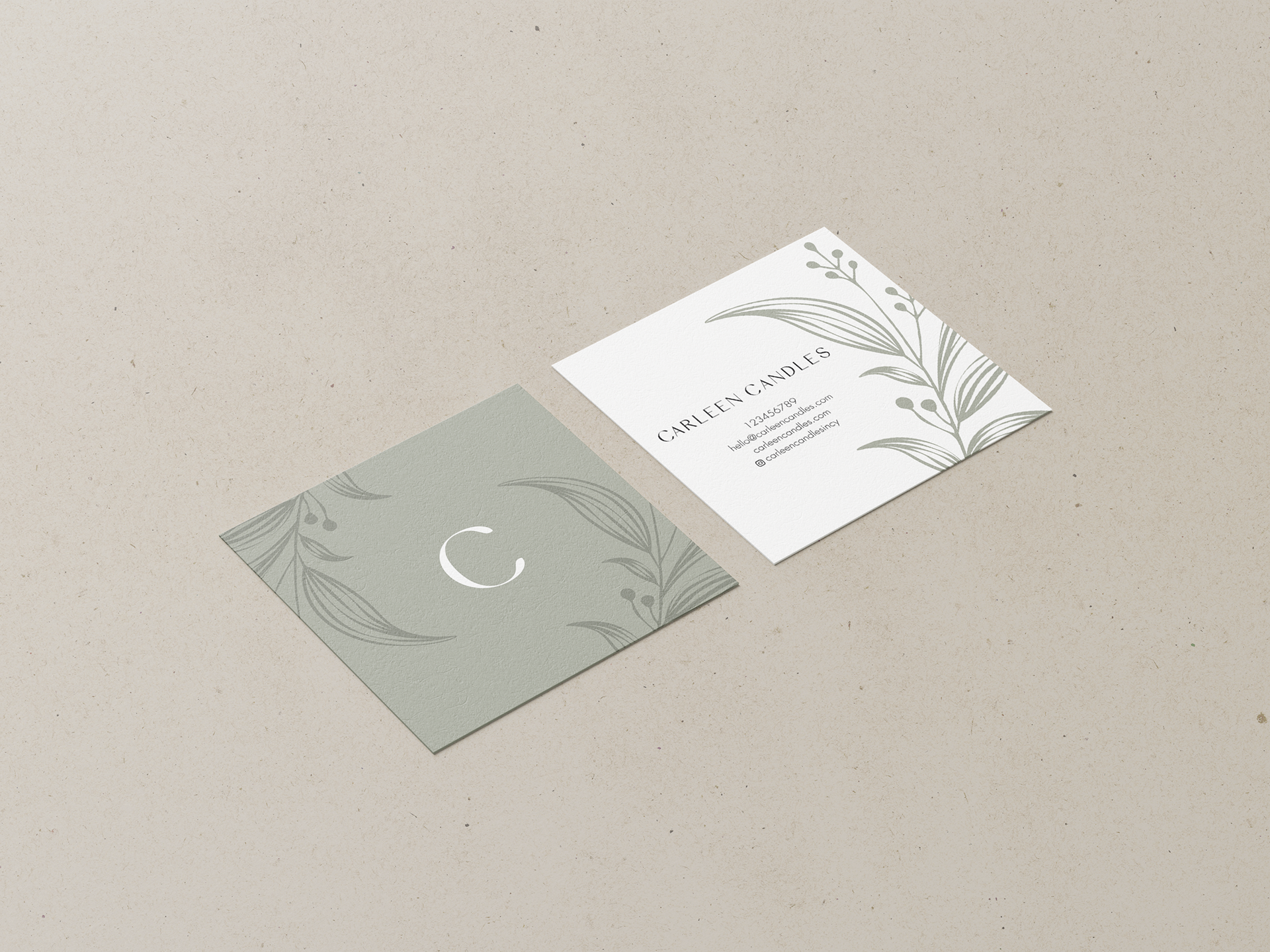
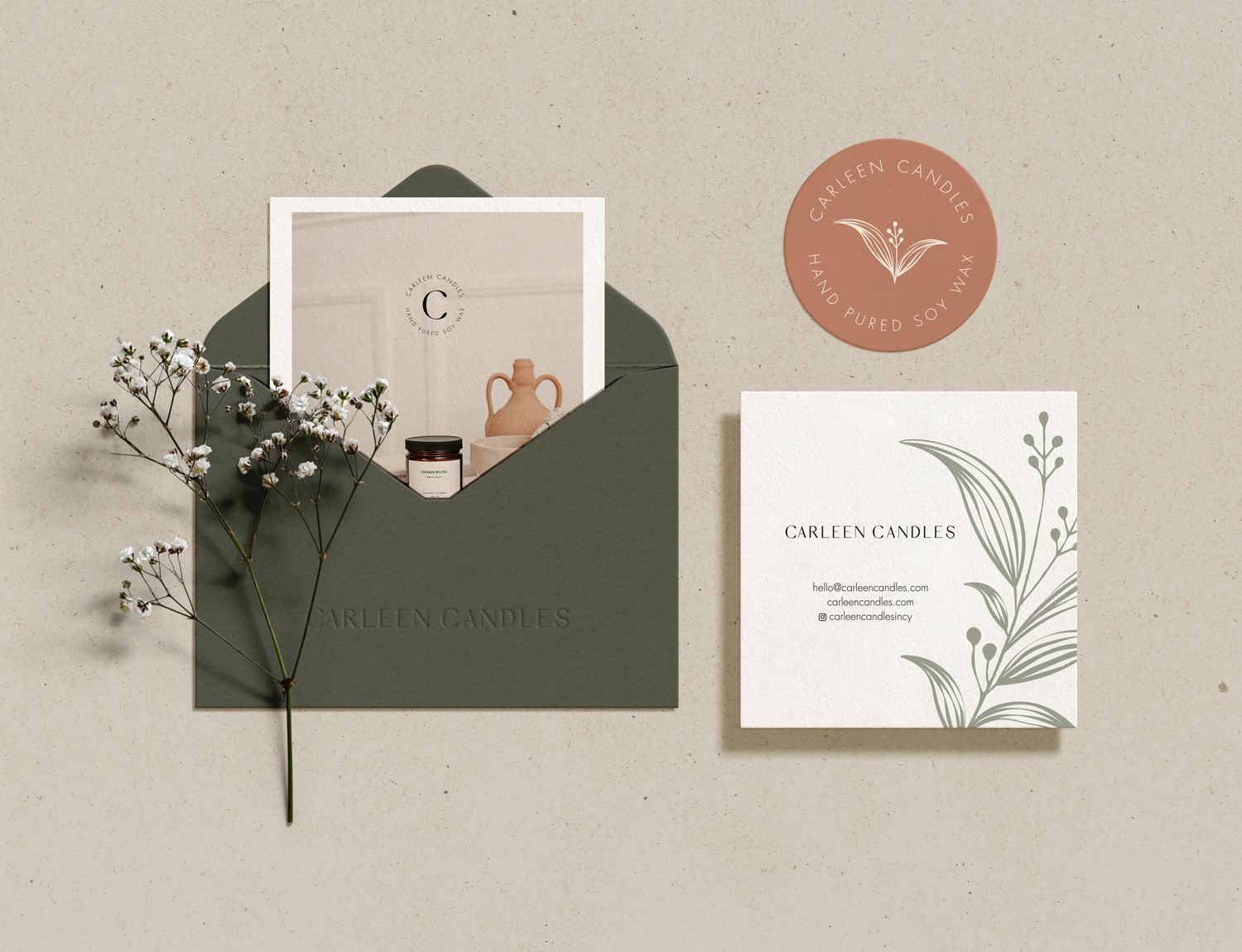
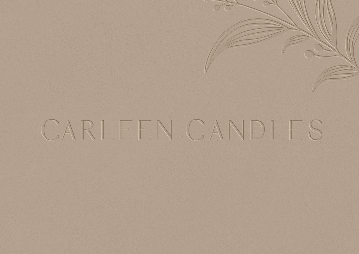
Primary Logo & Brand element
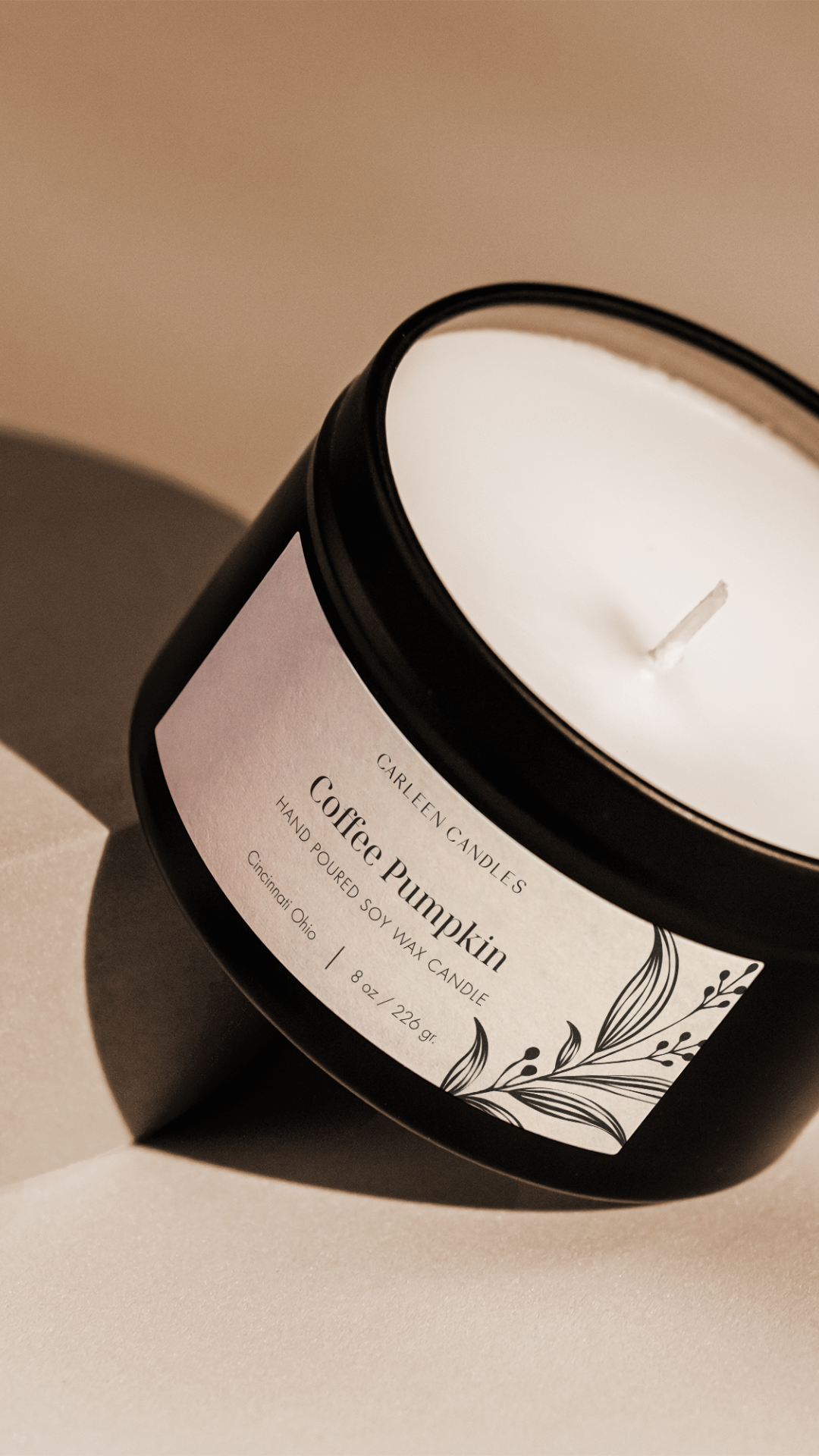
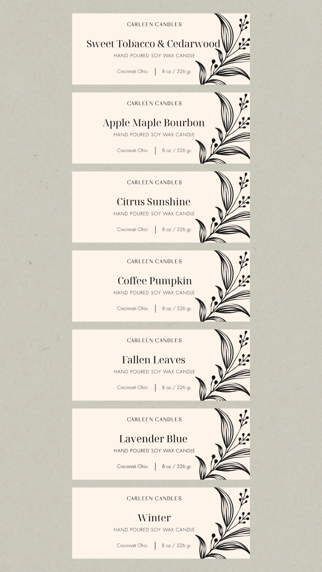
The Primary Logo embodies simplicity and elegance, with each element thoughtfully crafted to reflect the brand's commitment to purity, sustainability, and a natural aesthetic. The typeface is clean and sans-serif, with smooth lines and minimal decoration, aligning with the brand’s values of clarity, authenticity, and focusing on essentials. This minimalistic approach lets the logo feel modern yet timeless, speaking directly to Carleen Candles’ environmentally conscious audience.
The custom 'C' and “S” are idelicately softened, creating a more organic feel reminiscent of leaf shapes. This subtle design choice enhances the logo's natural essence, aligning seamlessly with the brand's focus on purity and sustainability. These refined details bring a touch of nature into the typography, adding warmth and character while maintaining a clean, minimalist aesthetic that speaks to Carleen Candles’ environmentally conscious mission.
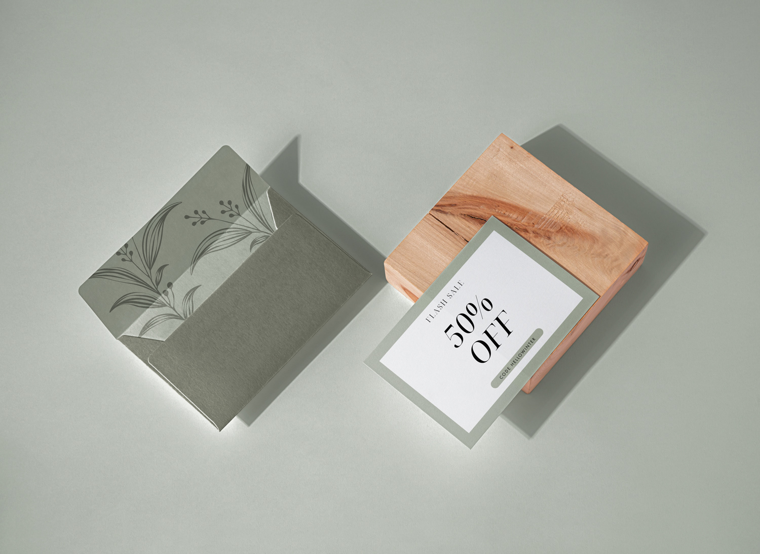
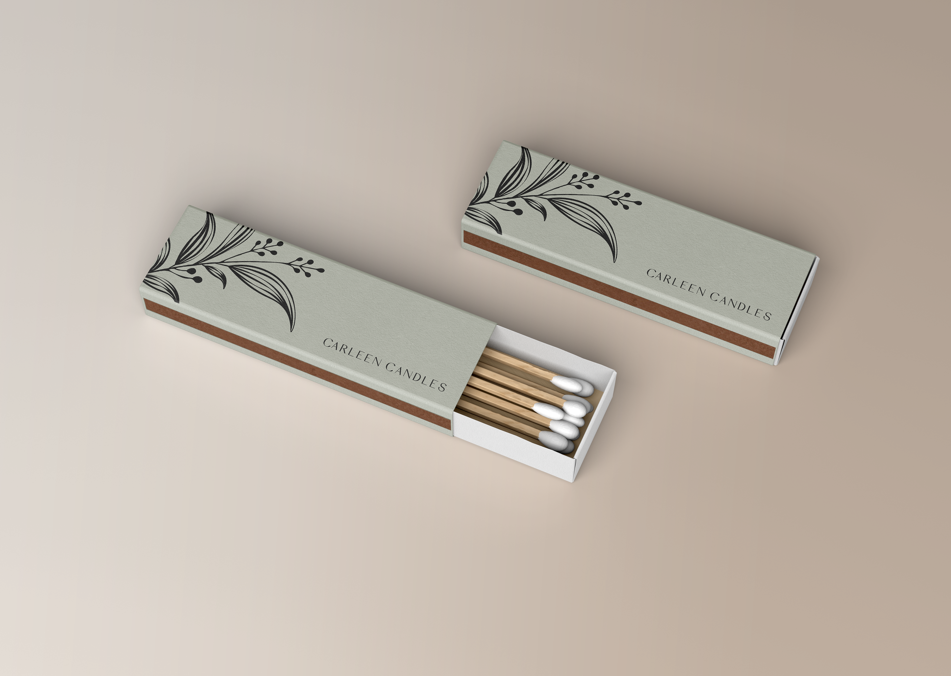
The hand-drawn, organic plant motif is a key element that seamlessly aligns with the brand's dedication to nature, purity, and sustainability. Its delicate, artisanal quality adds a handcrafted touch, making each product feel special and unique. This design invites customers to embrace the natural and mindful lifestyle that Carleen Candles embodies.
The Result